Float your boat with 10 garden design tips for to make sure your space oozes glam.

If you are searching for essential garden design tips, look no further.
The ‘Ocean Liners: Speed and Style’ exhibition at the V&A Museum explores the history of one of the most iconic symbols of luxury and glamour. The showcase looks at how ocean liners have influenced all areas of design, from graphics to crockery, carpet print to chairs. This classy, comprehensive exhibition, the first ever about ocean liners, looks at all aspects of their development and impact on society. With over 2000 artefacts on display, it follows the ocean liner’s inception in 1859 with Brunel’s ground-breaking Great Eastern, through the golden age in the early 20th century, to the gradual decline of their popularity in the 1960s as cheap air travel became commonplace.
The self contained luxury of the ocean liner is a surprisingly rich source of inspiration for garden design. As in most urban and sub-urban gardens, space on an ocean liner is at a premium, and its design needs to combine the right mix of functionality and aesthetic appeal to be successful.
Drawing down garden design tips and style essentials from the exhibition at the Victoria and Albert Museum is totally plain sailing. Here we look at 10 garden design syle tips to help you chart a course to be the high priestess of the seas.
Create Sentiment within the garden

The largest piece of salvage from the Titanic
One of the highlights of the show is the salvaged item from the Titanic. Possibly the most famous story that people associate with ocean liners is the one that has the most disastrous ending. Found floating on the surface of the Atlantic, this panel was situated over the door of the first class lounge and is the largest remaining fragment from the ship. It is the first time the panel has been seen in Europe since the Titanic sank, and it is a sombre punctuation to all the glitz and glamour that goes before it in the exhibition. Adding sentiment to a space creates authenticity and makes it personal. Most of us have childhood memories of time spent in a garden. My own garden had large willow tree where I spent many hours sitting under its canopy or playing on a swing suspended from one of its branches. I was (and still am) sentimental about it. Consider planting a tree in your garden in memory of someone, or get a child to help you plant it. Press found objects, hand or footprints, into a patch of wet concrete. Adding sentiment lets people in. Do it well and you will create a sense of integrity in the space.
Use bold lines to carve up the space

Strong lines in this NYK poster are perfect for your garden design style tips
For over 100 years Ocean Liners were the primary means of intercontinental travel. They became the pride of many nations and stiff competition meant that companies invested in bold promotional strategies to sell their voyages. Everything from the company headquarters to the sales brochures screamed glamour and aspiration. Make this your model when planning your garden. Be bold. Create strong shapes in the centre of the space and allow the planting to soften the edges. Let the lawn have a voice and make it on level billing with the patio. Try art deco motifs – the ultimate art moderne look that transcends time. If you need to mix angles with circles this is the way forward. It doesn’t date and is easy to achieve. Look at the graphic language displayed in this poster. Imagine that the square is a patio and the circle a lawn. Let the edges fill over on planting and bingo, you’ve taken your garden from drab to fab.
Clever Storage is essential

Martha Chenal vanity case by Louis Vuitton
On an ocean liner, much like in many of the small gardens I design, space is tight and storage provision needs to be compact, efficient and clever. The huge diversity of wonderful luggage and travel sets that were made during the heyday of modern ocean travel is worthy of an exhibition in itself. When you are planning your garden, consider what you need to store. Look at any void spaces you have in the garden and how you might utilise the best effect. You don’t want the biggest and most visible thing in your garden to be an ugly shed or storage unit. Consider several smaller units instead of one large structure, and try to lose them in the shadiest, dullest, least noticeable part of the garden. Be ruthless if you can. Consider the old adage: a place for everything and everything in its place.
Supersize to add drama

Busby Berkeley sequel style glamour aboard ship
Nothing creates drama in the garden like a super-size feature. The mind boggling size of a cruise ship can be awe-inspiring when viewed up close and for millennia humans have regarded oversized structures as a symbol of wealth, power and achievement. On a smaller scale, you can apply this idea in your garden to great effect. If you have the space to make a feature large and bold, do so. Make a bespoke bench seat deeper than it needs to be and it instantly adds an air of decadence. A super-sized flowerpot evokes the larger than life whimsy of Wonderland or Willy Wonka. Be selective with what you choose to super-size (there is a fine line between adventurous and absurd) and it will pay off in dividends.
Attention to detail works every time

Intricate detailing here in the oriental inspired flapper dress
Nothing says quality like detail. Time well spent on good finishing or intricate work always smacks of money, expense and high-quality. Wherever possible, apply this to your garden design. Add a row at intricately patterned tiles to a rendered wall. Mitre cut decking corners and install screws in neat lines. Ensure paving joints are even. Take time to plan the placement and spacing of plants. A little extra care with your detail and finishing, such as in this exquisitely beaded flapper dress belonging to the American beauty Miss Emilie Grigsby, can make the difference between ‘Oh, that’s nice’ and ‘Wow, that’s amazing’.
Plan for success

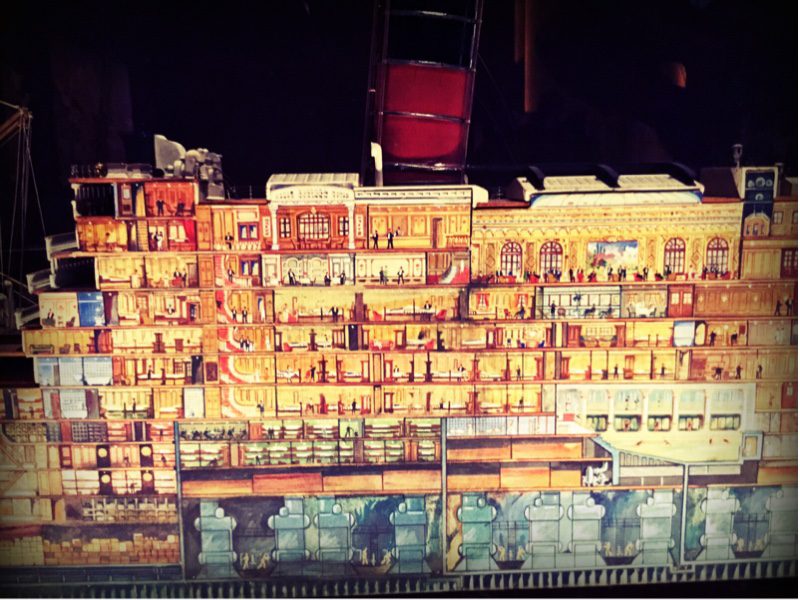
Plan your space. Sectional model of Berengaria.
Throughout the exhibition there were models and drawings of the detailed designs drawn for every ocean liner ever built. To create something so vast and complicated takes exhaustive planning. Although your garden may seem simple by comparison, I can’t stress how important a plan is to achieve your perfect design. Even if you know you will need to undertake the project in stages, starting with a good idea of what you want the finished space to be is crucial to getting it right. In most cases building a garden piecemeal without proper planning creates an itty-bitty, ad hoc affect, and could end up costing more money than necessary. I have visited many new clients over the years who have had a patio installed on a whim, without even thinking about the rest of the garden, which they have soon come to realise doesn’t really work for them. It is either not deep enough, in the wrong position, or the wrong shape. They end up either installing a completely new patio within the new design, or I am faced with the task of designing a usable space around the existing patio.
Create reflection to double the space

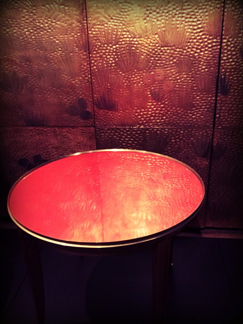
Add reflection to your garden design style tips to create a dose of luxury
There is something about a shiny reflective surface that instantly elevates a space. Maybe its a second chance to show off a feature, or to view it from all angles. Add a reflective pool, a sheet of black Perspex or a glazed tile. Ocean liners did this in spades with mirrored panels and lacquered surfaces. Here this lacquered side table by Jean Dunard makes it to the first class lounge on the Normandie.
Add texture and you add drama

The Tynecastle canvas gave the rooms a rich and opulent feel.
Contrasts add interest to any space and texture is a great way to achieve contrast easily. Explore plants with texture to create a mixed planting palette. Consider textured tiles to clad feature wall. Use creeping ground cover plants in between patio slabs. Use texture and contrast wherever you can to create a really dynamic space. Here, this Tynecastle canvas was featured on P and O liners used to new types of decorative materials. This canvas was an embossed wallcovering manufactured in Scotland. Lightweight able to flex with the movement of the ship it emulated fashionable Spanish leather giving the rooms a rich and opulent feel.
Use colour well to unite the space

A whole wall of posters, all using a similar colour palette
Colour is transformative and can dictate the emotion in the space. Use it wisely to create the mood and set the atmosphere of the garden. Bright jazzy colours will enliven the sneses while simple green and white hues will create tranquillity. Here, despite there being many graphic images the recurrent colourway draws all the posters togther. Red, black, blue and white dominate and are symbolic of the posters of the time. Use a similar technique in your garden to unify the space.
Repetition creates harmony

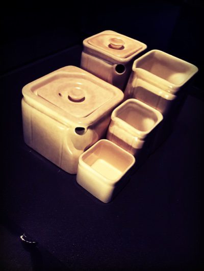
Cube tea set keeps the same shapes to create a stylish set
Here we see repetition in spades. Simple repetition of the same shape through the space will give it harmony. There are no hidden surprises. Used spheres of sandstone next to box balls and steel spheres to balance the repetition. A series of planters at the top and bottom of the space act like bookends. This tea set by George Clews used on the Cunard line. Scream style and sophistication with its iconically simple art deco shape and ‘back to basics’ materials.
To see more photos from this exhibition please visit our Pinterest board ‘Ocean Liners : Speed and Style’ or our Facebook album ‘Ocean Liners : Speed and Style’. The exhibition runs until June 17th 2018 at the Victoria and Albert Museum.
