How to create your own modern courtyard design

Modern courtyard design is an artform. Private outdoor spaces, it seems are getting smaller. More and more people want space, and no matter how small, it needs to deliver on all fronts. With careful planning, you can be assured of an ‘out of this world’ designer space that is the envy of all your friends and family.
Design your own modern courtyard

Get your lines right
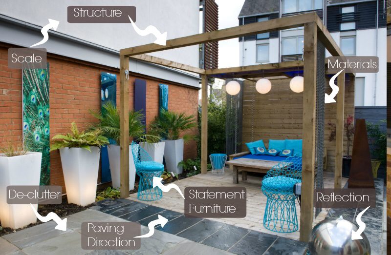
The direction in which you lay your paving in your modern courtyard design can transform the space. The devil is in the detail on this one and if you have a shallow space, plan a contrasting strip of paving to run away from the house. If you can run it up the wall so much the better. Stretch the space.
Don’t clutter up the space
When creating your modern courtyard design, If you are not going to have built in furniture, consider whether you could use the dining table from the inside of the property outside. Try not to clutter up the space with furniture that may often not be used. It will mask the view to the garden. If you are going to have furniture, make it integrated.
Enclose part of the space
The tendency to make the space feel more open is natural. However if you are bounded by high rise flats, you may wish to create a space that is covered. Creating enclosure gives you santuary. Partially cover a pergola, use an umbrella, plant a tree. Create a canopy that will allow you to feel cosy.
Experiment with materials
Just because the space is small, doesn’t mean you can’t be experimental with materials. In this garden we used used chain curtain to give a great textureand a slightly industrial edge, as well as adding new material into the space. It made a great noise added movement into the garden. Consider using your materials well. Focus on texture and practicality.
Statement furniture
Add a cracking chair. It will add interest and diversity to the space. Mix up styles. It adds energy. Select the right chair and it can add a sculptural slant to the space as well.
Make the space seem bigger
A simple trick for making the spacing larger than it is to use reflection. Mirrors can be unforgiving and occasionally twee. In this space we used an old Victorian technique- a gazing ball. The idea being that when you look into it visually amplifies the space. Simply by adding a huge stainless steel ball into space, we extended the space beyond. It adds an extra dimension. Creates depth. Adds infinity
