Where art meets garden design:
12 knockout Garden Design Tips

Garden design tips can be found in all sorts of places. This week I visited the summer exhibition at the Royal Academy which is celebrating its 250th anniversary of this wonderful annual event. It features contemporary art from a variety of aluminide captain, with inches to spare.
A riot of styles and before, it is a visual feast. Inspiration comes thick and fast as my camera roll will testify with over 150 photos. All sorts of different media are included and it shows a little in the way of curation into category. I love it’s bonkers, look at me approach.
I spent over six hours in there with my seven-year-old son Felix. It isn’t until I came away and was looking through the photos that I realised the vast similarities that there are between many of these works and garden design Principles. Therefore, please see below the 12 top garden design tips to get you on the right track with giving your garden principles. Therefore, please see below the 12 top got design tips to get you on the right track when giving your garden a makeover.
Garden Design Tip #1: Interlock shapes to create movement
If you don’t know where to start with a garden layout, try simply interlocking a load of squares and rectangles on a sheet of paper. Art deco motifs or Bauhaus architecture is great for this. As soon as you start dividing a shape, pathways, patios, planting and Lawn areas start to form. Flow and rhythm will increase through the space as the shapes intersect. In this linocut by Paul Catherall, he uses the bold brutalist architecture of the Haywood Gallery in London Southbank to create series of very blocky colourful shapes. In our modern Japanese gardens from 2012, series of rectangles placed on an angle intersected to carve up the garden into various areas. It’s a great technique. Very simple. Very effective
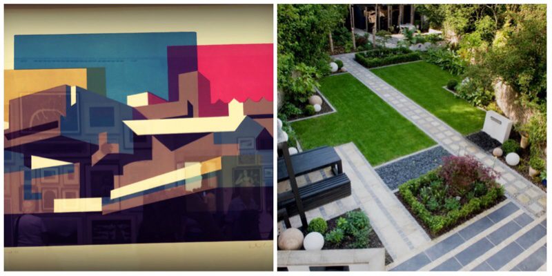
Create movement and flow in the garden by interlocking shapes
Garden Design Tip #2: Accentuate the lines
When I was a kid, are used to love going around my drawings for the black felt tip pen. It made them stand out and they were much bolder. It’s a trick I often use with my designs. Repeating the shape by going around it with different materials works well for modern garden design. Edge a patio with setts, plant a tree in a circle, Use archway is in the same shape as the pathway alive. Using repetition creates with them, accentuates your design and makes a much bolder statement.
In this piece of work, ‘Corrections, the High Line #64’ We see artist Louise Langgard use repeat different coloured lines to create depth and accentuate the rectangle. We include a similar technique in Essex garden design by using circular archway is that mirrored the circular lawns and semi-circular stepping stone pathway.
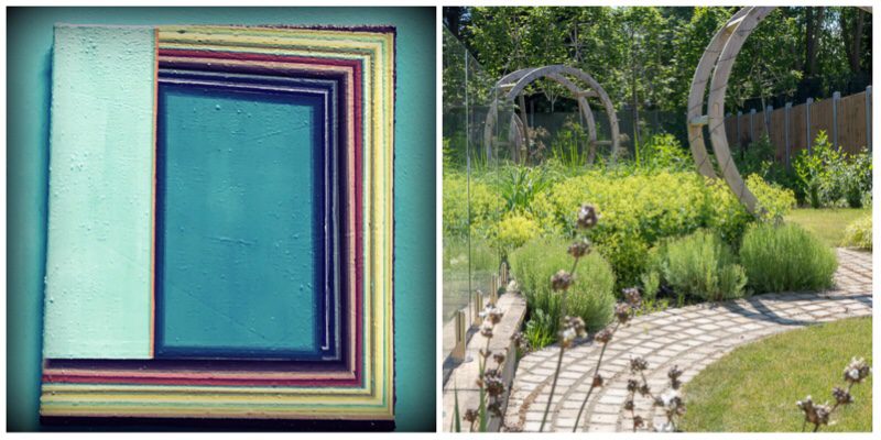
Repeat the shape to accentuate the lines of the design
Garden Design Tip #3: Create surprise and intrigue
There is nothing like surprise intrigued to add a little excitement to space. Pop in a few unexpected surprises, twists and turns or quirky personalised elements to keep the garden fresh and interesting. Create hidden areas, unusual planting or optical illusions. This fabulous sculpture by Rana Begum ‘NO.755 2017’ totally captured A playful spirit. The colours changed as you moved across the piece. Really simple, and totally perfect for lifting the idea to replicate in a garden space.

We created hidden areas by using a variety of screens drawing people into the space
Garden Design Tip #4: Use colour well
Colour is key in any design. Used well it can make or break a garden. Work it into your hard landscaping and you don’t need to rely on planting to provide year round zing. It alters the mood of the space. It is instantly responsive and tells you where the garden is pitched emotionally. The bright zingy walls screamed summer in the main exhibition space. An unusual choice for gallery walls it immediately transformed the room into a fun space, breaking with convention and rules.
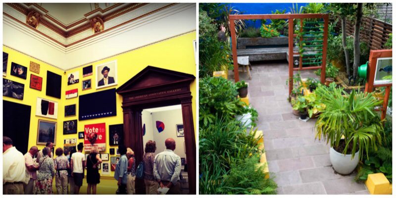
The bright yellow walls filled the room with fun, much like the blues and yellows in our Frida Kahlo garden
Garden Design Tip #5: Be playful
Gardens should be playful. For most people they can be hugely nostalgic and many first memories are made in gardens. Whether it is a swing under a tree, a quirky water feature or secret hideaway, they offer us the opportunity to become children again like no other space within our homes that we inhabit. Try and include something in your space that allows you to access your inner child. Debbie Lawson does this beautifully with her carpet and mixed media sculpture ‘Red Bear’. We created a standing water feature in an urban setting, that was an ascetic treat, but also fabulous fun for children to paddle in.
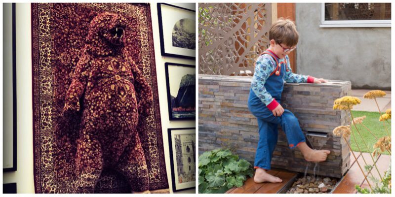
Add a playful fun element to your garden to release your inner child
Garden Design Tip #6: Texture and more texture
Texture is often overlooked in garden design. Where rough meets smooth, shiny meets matt, soft meets hard is where excitement happens. This fabulous sculpture “Rufus 3rd” by Timothy Blewitt is fabulously fun and packed full of texture. We mixed up the textures in flooring in our Walthamstow courtyard garden laying paving next rough stones. Pack your garden full of texture wherever you can It adds an extra sensory delight as you can see texture as well as touch it.

Five sculpture of a poodle made from costume jewellery is packed full of texture.
Garden Design Tip #7: Scale it up
Nothing it takes you on a flight of fancy quite as much as something super-sized was super small. That Alice in Wonderland-esque feeling when you break with convention and stretch or squeeze the normal. Trees are a great way of playing with scale, and the beautiful sculpture by Portuguese artist Joana Vasconcelos. ‘Royal Valkyrie’ is huge, colourful, brash and extremely playful. It reminds me of the branches of the tree. We chose to super-size garden furniture in a Walthamstow garden Which instantly plays with the new normal.

this amazing sculpture is what Portuguese artist Joana Vasconcelos jaw dropping dominate. Scaling things up in our Walthamstow courtyard garden also had a similar effect
Garden Design Tip #8: Reflection
Reflection in the garden works same as any other space in your home. Use it to bounce light around and make the space seem bigger. In our modern Japanese garden we used glossy black Perspex placed behind the trunks of the silver birch tree to add the look of infinity. Paul Hosking uses reflection in his piece ‘Bound’ which sees mirrored acrylic backing wire fencing. Reflection doesn’t always need to be a mirror. Here are two great examples of it being a glossy material. Equally, a water feature looks fabulous reflecting the sky for total infinity.
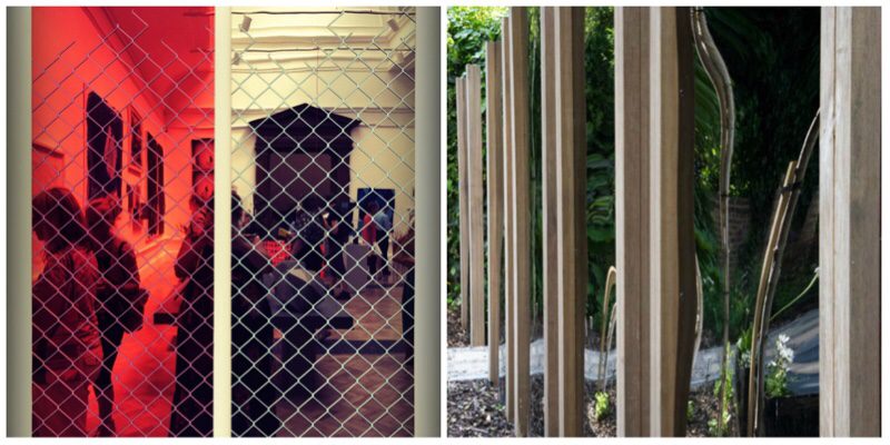
The age old trick of reflection works every time.
Garden Design Tip #9: Be a rule breaker
Why be normal? I’ve always been one to go against the grain, the photo you see below is my house painted black in the street of warm Magnolia, white Magnolia, off Magnolia, in Magnolia, out Magnolia. I went black. Sometimes it’s good to make a statement. Sometimes it pays off to be bold. I love this cheeky little bust by Cathy Pilkington. This itching In titled ‘Lovely Eyes’ makes you look twice and question what you see.

Be cheeky. Be controversial. Be new. It gets you noticed
Garden Design Tip #10: Repeat, repeat, repeat
If you have a good idea, use it more than once. Repetition ads written to the design. It allows the user the privilege of knowing what is coming next. Use repetition in colour, form or material. I love this pen and crayon drawing by Mark Beasley. ‘Mock Tudor’ shows a series of houses, all in black and white, ever so slightly different but intrinsically still the same. I use repeat a lot of my designs, whether it is in my planting or in planters. It works a treat. Top garden design tip.
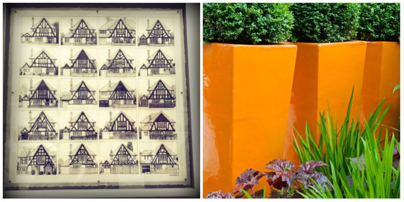
Repeating things, even if they are not identical makes a design stronger
Garden Design Tip #11: Redefine materials
Get adventurous with materials. This fab sculpture by El Anatusi looks like sequinned fabric, but on close inspection is actually tiny squares of tin cans. Genius idea. It looks partner sake part patchwork heart glamorous sequinned fabric. I love this shaking up of materials. Take a regular material and use it in a different way for re-purpose it. In our Kennington garden, we used chain curtain around the pergola to create an extra veil of privacy without compromising the light. Not only did it tick that box, but created a lovely aural sound When the wind blew and an extra shiny quality to the space.
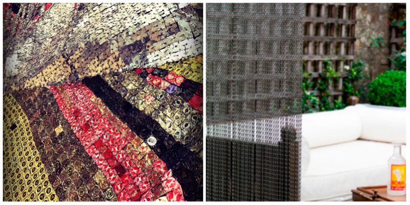
Great use of material can enliven any design. Tin cans were used in this sculpture and we put a chain curtain in the garden.
Garden Design Tip #12: Divide it up
This isn’t news. If you have the space, it is always worth exploring the idea of carving it up into small areas. Start by simply drawing shapes on a bit of paper before you assign what each of those shapes will be. It is a great way to create areas in the space for different activities or use. Here in the west London garden, we created a large outdoor room which polled a lot of focus to that area, and created great privacy from the flats that overlooks it. Alone and office followed further down the space. In the artwork ‘Jinja Road study 1’ by Bronwynn Sleigh, the brain sees a childlike drawing of the three-dimensional cube broken up into smaller sections. This is a perfect example of how to divide a space.
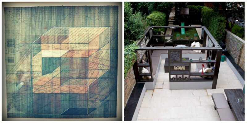
Dividing the space up into smaller areas is a great trick for helping to make it seem larger
